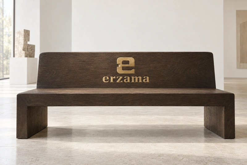
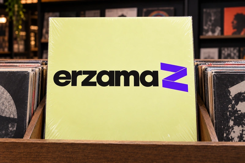
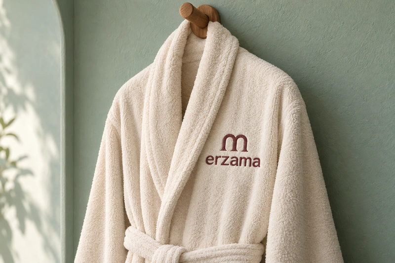
Erzama pairs a firm visual center with a softer, open ending. That balance gives it a considered character suited to businesses where taste, atmosphere or authorship matters. It could sit comfortably on a furniture collection, an independent publication or a small hospitality offering, with each application bringing a different aspect of the name forward.
The name leaves its category unstated, giving a buyer room to define a coherent world around it. A design house could emphasize precision and material quality; a cultural platform could favor curiosity; a guest-focused brand could draw out warmth. This openness also creates work: Erzama will need a clear descriptor and consistent introduction. Its pronunciation is not entirely self-evident, and any linguistic associations in intended markets should be checked before adoption.
Name analysis
Erzama contains six letters and is likely to be read as three syllables, although neither the vowel sounds nor the stress are fixed by the spelling. Plausible English readings include er-ZAH-ma and ER-zuh-ma. The rz sequence gives the opening a slightly abrupt quality, followed by the more flowing ama ending. Visually, the diagonal z interrupts a sequence otherwise dominated by rounded forms, while the two a letters create repetition. These features make the written name more distinctive than its category meaning, which is not obvious in English. No particular etymology or cross-language meaning is established by the supplied material.
Assessment summary
Erzama is a strong visual candidate for a character-led brand, particularly in design, culture or hospitality. Its compact structure and contrasting letter shapes are useful assets, while uncertain pronunciation and limited category signaling prevent it from being an effortless all-purpose name.